Making Responsive UI Components with display: contents
Recently, I revisited the display: contents property and was amazed by the possibilities it offers for responsive web design.
In simple terms, applying display: contents to an element essentially removes it from the DOM flow while preserving its child elements.
Therefore, the element is “invisible” to the browser layout engine, but its child elements remain fully styled and rendered. The element itself no longer affects the page’s layout, but the content inside does.
Why is this useful?
One key advantage of display: contents is that it allows us to effectively “unwrap” an element from its parent without changing the structure of the HTML.
This can be especially handy when you need to break out of existing layout constraints to create new ones, where a higher-level parent defines styles for its children.
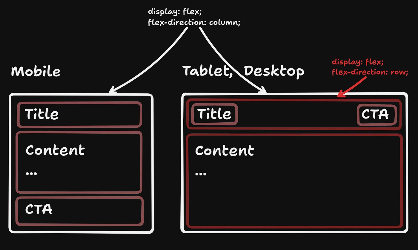
A Real-World Example: Responsive Card Layout
Let’s take a common use case: a responsive card component that changes layout depending on the screen size.
On larger screens, we might want the call-to-action (CTA) to be on the same row as the title. On smaller screens, we want the CTA to move below the content.
What problem does display: contents solve?
When the layout shifts from mobile to desktop, we want the CTA to move from the bottom to the top row, without using techniques like position: absolute.
Ideally, we want a clean, responsive layout built on top of Flexbox, which offers easy alignment, distribution, and spacing via properties like gap.
Layout and Styles
We begin with a .card wrapper element that contains .card-title and .card-content as child elements. Here's an example of a basic card structure:
Now let’s add some basic CSS:
Note that I only added the required layout styles in the following code snippets. To see the full styles, check out the code at the end.
How Does It Work?
When the display: contents rule is applied, this property causes the browser to disregard the .card-title element in the layout, effectively removing it.
This results in that the contents inside .card-title (the title and button) are laid out as if they were direct children of the .card container.
Now, the title, CTA, and content all reside within the same flex container, making it easy to manipulate their order using Flexbox properties.
The order property is particularly useful here—it allows us to reposition the button based on the screen size.
By setting the order of the button to 1 on small screens and 0 (default value) on larger screens, we change its position relative to other elements without modifying the HTML. Read more about it here.
Conclusion
display: contents is a powerful tool for breaking out of typical DOM hierarchies and achieving clean, responsive layouts. Combined with Flexbox, it enables us to easily build flexible components that adapt to screen size changes.
more articles
Newsletter
Subscribe to get notified about new articles and updates.